AWIPS Tips: Create Colorized Model Plots

Welcome back to AWIPS Tips! This week we're back with another post about the capabilities of python-awips. If you haven't seen any of our previous entries about python-awips, please take a glance through them to familiarize yourself with the python package. This week we are focusing on model (grid) data, and how to colorize and plot it using the python package Cartopy. Follow along using the Colorized Grid Data notebook.
Similar to most of our other python-awips notebooks, we start by pointing at our EDEX server and then creating and using a data request object. To see a detailed walkthrough of how we get model data, please refer to our first blog post about python-awips. We already knew exactly which fields we wanted, but for more information about how to explore the parameters and what is available, take a look at this notebook.
Before we continue working with the data, now is a good time to explain the make_map function defined in the notebook. The make_map function does not use any parameters, so it does the exact same thing every time it's called. This function is also defined in many of our other notebook examples, so you're sure to come across it again if you browse through our notebooks.
Now that we have some data, and understand our defined function (make_map), we can proceed with actually creating colorized plots! Grib data can be accessed from the response object using the following:
response = DataAccessLayer.getGridData(request, [fcstRun[0]])
grid = response[0]
data = grid.getRawData()
We access the geographic information from the grid data
lons, lats = grid.getLatLonCoords()
and use that information to create a bounding box. We also convert from degrees Kelvin (what the data are stored in) to degrees Fahrenheit for easier understanding.
destUnit = 'F'
data = convert_temperature(data, 'K', destUnit)
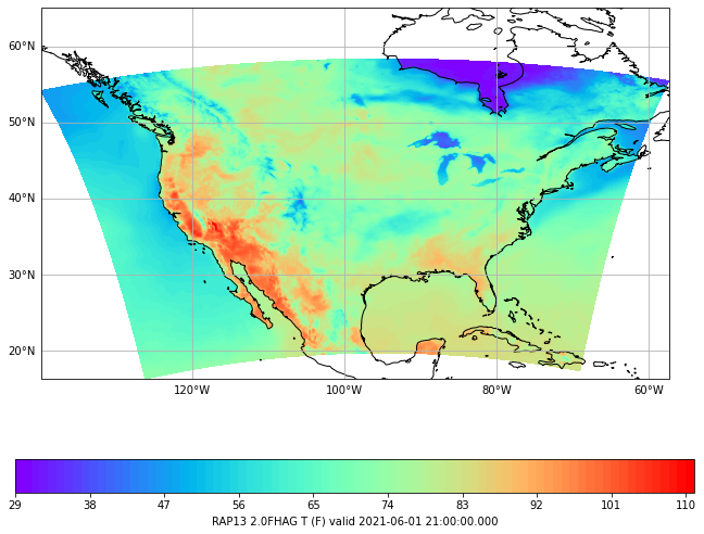
Now we have everything we need to create some plots! Two Python tools we will demonstrate are pcolormesh and contourf which are both part of the matplotlib python package. Both methods need the geographic information, data, and a colormap. The colormap helps control the colors used to visualize the data. In both examples here we use the rainbow colormap, but a comprehensive list of available colormaps can be reviewed here. The outputs are below:
pcolormesh

contourf
We hope you enjoyed this week's entry and are able to try out the Colorized Grid Data notebook yourself. Please check back in two weeks for another AWIPS update.
To view archived blogs, visit the AWIPS Tips blog tag, and get notified of the latest updates from the AWIPS team by signing up for the AWIPS mailing list. Questions or suggestions for the team on future topics? Let us know at support-awips@unidata.ucar.edu
Add new comment