Conventional Weather Reports
Data From Weather Reporting Stations
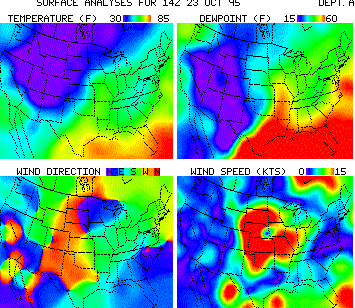
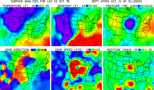
Weather stations around the world report atmospheric temperature, pressure,
winds, cloud cover, visibility, special weather conditions, and other observations.
These data are collected on a regular basis and made available from the National
Weather Service (
NWS
) via the
Domestic Data Service (DDS) which is part of the
NWS
Family of
Services(FOS). Through a subcontract
with
Alden Electronics,
the the FOS data streams are disseminated to universities via
the Unidata IDD. Many universities have configured their Unidata systems to
generate weather maps automatically as the data comes into their systems. For
example, the University of Illinois produces hourly maps showing
temperature, wind speed and other parameters throughout
the country in the form of color contours on a map background. These maps
can be found on their
Daily Planet
WWW server.
Weather Maps for Meteorologists
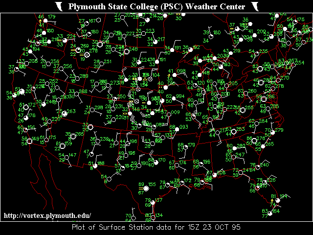
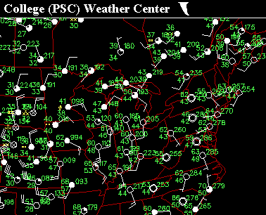 Plymouth State College
uses the same data to create the kind of hourly weather maps
that meteorologists
and pilots are accustomed to using. These maps contain more information
from the reporting stations along with data from radar stations. In this one,
the weather reports from ground observing stations are shown in what meteorologists refer to as
station model plots. The plots show information
about temperature, pressure, dew point, cloud cover, wind speed and direction, and
special weather conditions at each reporting station. Contour lines represent
the atmospheric pressure in another form. The map also has the locations of
high and low pressure areas and fronts which are introduced into the Domestic
Data Service by the NWS. These maps are similar to those found
in many daily newspapers.
International Weather Reports
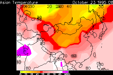
This map generated at the
University of Michigan
shows that weather
reports from around the world are delivered on a regular basis by
the Unidata IDD. In particular, the data used to generate this
map are part of the
International Data Service (IDS)
which,
along with the DDS, is part of the Weather Service
Family of
Services(FOS). All FOS data products are injected into
the IDD at Alden Electronics.
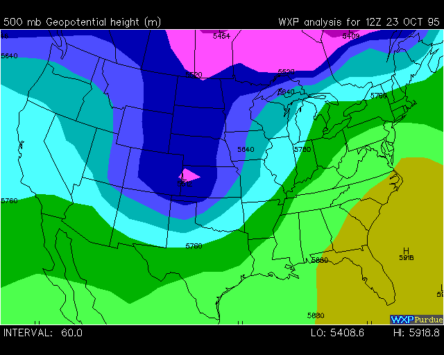
Upper Air Observations
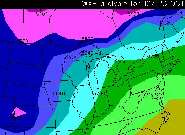
As this map from
Purdue University
shows, observations of conditions
in the upper atmosphere are available in addition to
surface weather measurements. In this case, a contouring
routine from the Purdue WXP software package was used to display
the height at which the atmospheric pressure is 500 millibars.
These upper air data measurements are taken by balloon-borne
instruments on a regular basis and are transmitted as part of the
DDS and IDS product streams on the Family of Services.
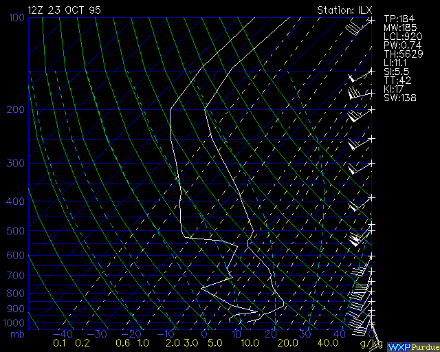
Using a different analysis program called a thermodynamic
diagram, atmospheric scientists can view the upper air
data as a function of height in the atmosphere above one
observing station. This "Skew T" thermodynamic diagram shows
the conditions measured in the atmosphere above Lincoln, IL.
 Weather stations around the world report atmospheric temperature, pressure,
winds, cloud cover, visibility, special weather conditions, and other observations.
These data are collected on a regular basis and made available from the National
Weather Service (NWS
) via the
Domestic Data Service (DDS) which is part of the
NWS Family of
Services(FOS). Through a subcontract
with Alden Electronics,
the the FOS data streams are disseminated to universities via
the Unidata IDD. Many universities have configured their Unidata systems to
generate weather maps automatically as the data comes into their systems. For
example, the University of Illinois produces hourly maps showing
temperature, wind speed and other parameters throughout
the country in the form of color contours on a map background. These maps
can be found on their Daily Planet
WWW server.
Weather stations around the world report atmospheric temperature, pressure,
winds, cloud cover, visibility, special weather conditions, and other observations.
These data are collected on a regular basis and made available from the National
Weather Service (NWS
) via the
Domestic Data Service (DDS) which is part of the
NWS Family of
Services(FOS). Through a subcontract
with Alden Electronics,
the the FOS data streams are disseminated to universities via
the Unidata IDD. Many universities have configured their Unidata systems to
generate weather maps automatically as the data comes into their systems. For
example, the University of Illinois produces hourly maps showing
temperature, wind speed and other parameters throughout
the country in the form of color contours on a map background. These maps
can be found on their Daily Planet
WWW server.
 Plymouth State College
uses the same data to create the kind of hourly weather maps
that meteorologists
and pilots are accustomed to using. These maps contain more information
from the reporting stations along with data from radar stations. In this one,
the weather reports from ground observing stations are shown in what meteorologists refer to as station model plots. The plots show information
about temperature, pressure, dew point, cloud cover, wind speed and direction, and
special weather conditions at each reporting station. Contour lines represent
the atmospheric pressure in another form. The map also has the locations of
high and low pressure areas and fronts which are introduced into the Domestic
Data Service by the NWS. These maps are similar to those found
in many daily newspapers.
Plymouth State College
uses the same data to create the kind of hourly weather maps
that meteorologists
and pilots are accustomed to using. These maps contain more information
from the reporting stations along with data from radar stations. In this one,
the weather reports from ground observing stations are shown in what meteorologists refer to as station model plots. The plots show information
about temperature, pressure, dew point, cloud cover, wind speed and direction, and
special weather conditions at each reporting station. Contour lines represent
the atmospheric pressure in another form. The map also has the locations of
high and low pressure areas and fronts which are introduced into the Domestic
Data Service by the NWS. These maps are similar to those found
in many daily newspapers.
 This map generated at the University of Michigan
shows that weather
reports from around the world are delivered on a regular basis by
the Unidata IDD. In particular, the data used to generate this
map are part of the
International Data Service (IDS)
which,
along with the DDS, is part of the Weather Service Family of
Services(FOS). All FOS data products are injected into
the IDD at Alden Electronics.
This map generated at the University of Michigan
shows that weather
reports from around the world are delivered on a regular basis by
the Unidata IDD. In particular, the data used to generate this
map are part of the
International Data Service (IDS)
which,
along with the DDS, is part of the Weather Service Family of
Services(FOS). All FOS data products are injected into
the IDD at Alden Electronics.
 As this map from Purdue University
shows, observations of conditions
in the upper atmosphere are available in addition to
surface weather measurements. In this case, a contouring
routine from the Purdue WXP software package was used to display
the height at which the atmospheric pressure is 500 millibars.
These upper air data measurements are taken by balloon-borne
instruments on a regular basis and are transmitted as part of the
DDS and IDS product streams on the Family of Services.
As this map from Purdue University
shows, observations of conditions
in the upper atmosphere are available in addition to
surface weather measurements. In this case, a contouring
routine from the Purdue WXP software package was used to display
the height at which the atmospheric pressure is 500 millibars.
These upper air data measurements are taken by balloon-borne
instruments on a regular basis and are transmitted as part of the
DDS and IDS product streams on the Family of Services.
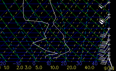
 Using a different analysis program called a thermodynamic
diagram, atmospheric scientists can view the upper air
data as a function of height in the atmosphere above one
observing station. This "Skew T" thermodynamic diagram shows
the conditions measured in the atmosphere above Lincoln, IL.
Using a different analysis program called a thermodynamic
diagram, atmospheric scientists can view the upper air
data as a function of height in the atmosphere above one
observing station. This "Skew T" thermodynamic diagram shows
the conditions measured in the atmosphere above Lincoln, IL.